Lisa-Jane Masters
Multi-Disciplinary Designer
BA DESIGN PRACTISE

Risograph Printing
Riso Printing Workshop - Analogue (PartA)
For This brief we were tasked to Create an experimental layered ( max 5 layers) abstract Riso Print combining the elements of a map/location that is significant to us, incorporating a halftone and a typographic month of the year inspired by designer Wim Crouwel’s, independent archive of typography designed calendar.
For this brief I had chosen the month of April and a map Of The Isle Of Skye, I chose this location as my Grandad Has lived on the Isle of Skye for many years which meant many summer memories on the island I have created target points of the two areas I have the most fond memories which is Broadford and Portree.
I wanted to experiment with my letters to create my more abstract composition by using rectangles and triangles within my letters , I really liked the outcome of this. In my positioning of the letters I was thinking of creating a compass to complement my map as my grandad when he was a young boy had to use the traditional methods with an atlas and a compass sometimes to get around in his days. I felt this created a quirky piece in which I was happy with. I chose pink and blue as I wanted the letters to contrast the background in which I feel is quite eye catching overall. Overall I was happy with my Final Analogue Print I think It Fits the brief well, however if I was to do anything differently I would maybe try and use more of My Paper as I feel I have a lot of white space that I could have experimented with.

Letterpress Printing
Letterpress - Deconstruction
Stanza Deconstruction stanza should be an abstract and non-literal response to chosen lyrics from a song or poem. We should experiment with ink techniques and type compositions.
Each Part Of This Brief highlights a new guideline to follow. Part 2 - Print no.1 - Should Be A3 on white paper - Using INK Of Your Choice In this brief we were to deconstruct our chosen song lyrics or poem and create an abstract representation.
My Chosen Song Was ‘Back to Black’ by Amy Whinehouse . For Part two We were to create a piece from Using Ink Of our own choice. Here I wanted to Try layering Colours On top Of Each Other, For This To be successful with saturated colours, I created my first layer of colour using red ink, repeating My composition 4 times in each corner of my page. I then Let This dry for 20 minutes so that I could layer my second colour Blue. In Which I wanted My blue Layer Of Repeated type to lay diagonally across the page, to make a Bold Impression. I learned from previous prints to layer my ink more heavy to get a good saturated outcome in which I was pleased with this one. In the end I feel this created a glitch Effect That I loved, this effect was created by making sure my alignment of the letters were slightly off from my red composition. I was very happy with this Print In The End.

Digitally Altered
Letterpress print
Letterpress - Deconstruction Stanza
Each Part Of This Brief highlights a new guideline to follow.
Part 3 - Print no.2 - Should Be A3 on white paper - Using ink of choice and a stencil In this brief we were to deconstruct our chosen song lyrics or poem and create an abstract representation.
My Chosen Song Was ‘Back to Black’ by Amy Whinehouse . For Part 3 We were to use an ink of our own choice and also use a stencil element within our print For this stencil letterpress I decided to use my print from my range of colours and layer it on top of my stacked organic stencil in photoshop.
In this print I used scale and colour to create an eye catching final. Using my abstract organic stencil I layered two copies of the same stencil on-top of one another using different hues and opacities of my chosen pink/purple colour in which created depth. My focal point is my letters in which I used the top of my letterpress print using the majority of yellow inked section with a gradient of red in which contrasts the purple tones in the background creating a eye catching visual for consumers. Using different opacities of pink/purple in the background I’ve created more colour range in which I managed to use a blend of colours from yellow to purple on the colour wheel. My letters/numbers of ‘90’ actually made me think of if it was flipped would be ‘60’ which inspired my 60s retro colour scheme in which I’m happy with the overall outcome of this print. If I was to change anything maybe I could have experimented with positioning of the letterpress however I think this worked out well for this final outcome.


"Magentopia"
Colour Pharmacy
The project brief tasks students with designing a “Colour Pharmacy,” an interactive public installation based on a specific Pantone colour, aimed at exploring and promoting the positive effects of colour on health and wellbeing. Located in a vacant city-centre retail space, the pharmacy should offer an engaging, multi-sensory experience that includes workshops, educational content, colour therapy insights, and a designer shop. The concept must be thoroughly researched, innovative, and include a data mapping element to support the Pantone Color Institute’s research. The final design should be accessible, sustainable, and creatively demonstrate the power of colour through immersive and interactive elements. Our group was assigned the colour Viva Magenta, and the outcome of our project was titled Magentopia. Here are some visuals from our final results.

2024 Creative Processes Exhibition
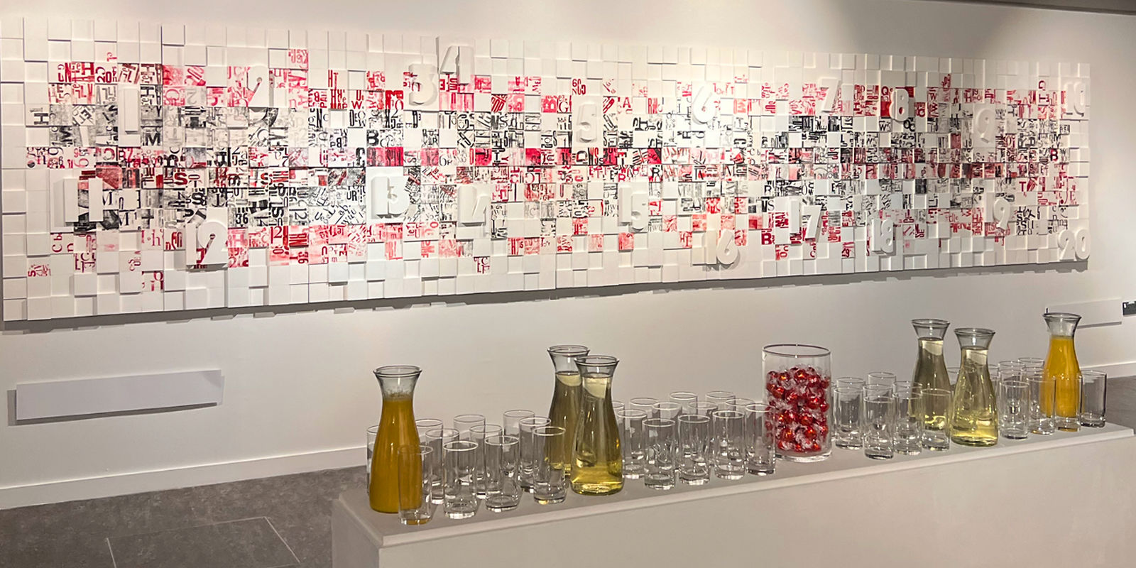
Our first exhibition was a celebration of creativity in all its forms. The show-stopper was an intricately crafted collaboration piece, created by repurposing our unused letterpress prints. This large-scale artwork was hung across nearly an entire wall. Each participant contributed a panel made up of squares, which were seamlessly connected to form one cohesive and striking piece of art.
The exhibition also featured a collection of letterpress and risograph prints—some left untouched, others digitally enhanced and blended. Together, they created a vibrant display of colour, texture, and shape across the gallery walls.


Typographic Journey
This brief we were tasked with creating an image using completely type face fonts to embody our assigned photographs. This was to coincide with Glasgows 850th anniversary’s so our assigned photographs are locations of well known areas within Glasgow. Here is my experimentation with type using a variety of scale, size, fonts and overlapping. To get this final result of Glasgow Central Station and The Lighthouse.
Additionally we had to incorporate our mark making experimentations from ours previous workshop. This added another element of texture and depth within the final result.


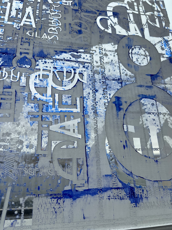
Laser Etched Panels - Typographic Response
Laser Cutting/Etched on Clear Acrylic:
In response to the brief and in alignment with our theme “Typographic Journey” for Glasgow 850, we used laser cutting technology to etch intricate typographic designs onto clear acrylic surfaces. These designs highlight Glasgow’s cultural identity and linguistic evolution through expressive letterforms and historical references. To enhance depth and visibility, we applied a blue paint wash over the etched surfaces, creating a striking contrast against the clear acrylic while adding an atmospheric layer to the installation. This technique complemented the immersive nature of Magentopia, tying visual storytelling to our chosen colour narrative and the city’s rich heritage.


Collaborative Installation - Acrylic Panels - Glasgow 850
Each Of my peers panels including mine was displayed at out spring Exhibition inspired by Glasgows 850th anniversary - at our Ba Design Practise - Professional Design Practice


Design Project 2025 " Clydeside Discovery"
Overview:
Clydeside Discovery is an interactive design proposal developed over three key briefs aimed at reimagining how we engage with Glasgow’s maritime history—particularly for younger audiences. The project is rooted in a real historical site beside the Riverside Museum, once home to the famous A. & J. Inglis shipyard.
oncept features two wave-shaped structures—one functioning as a slide, the other as a bridge—connected by a wool mesh to symbolise the River Clyde’s timeline and legacy.
-
A tinted acrylic enclosure creates wave-shaped reflections with light and colour.
-
Integrated QR codes and projections provide historical content digitally.
-
Repurposed materials such as steel from shipping containers and pallet wood reflect sustainable values.
The design is playful, educational, and inclusive, aimed at transforming underused museum land into a vibrant space that connects past and present through interaction and innovation.

